**Please Note**
Our email system is now back online.
If you experience any issues please email 
formara.russ@gmail.com or call 01702 613 141

Southend-on-Sea City Council

City Rebrand

Southend-on-Sea was award City status by Her Majesty the Queen as a tribute to Sir David Amess, MP for Southend West, who was tragically killed in 2021. 
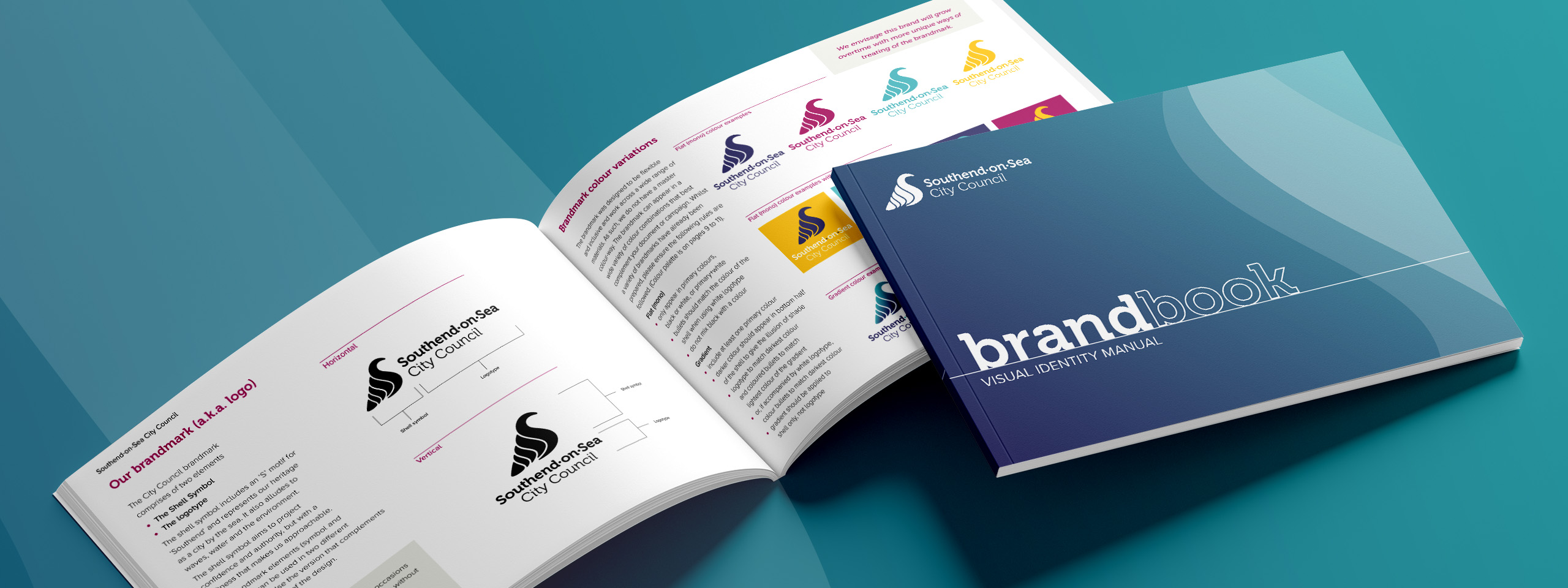
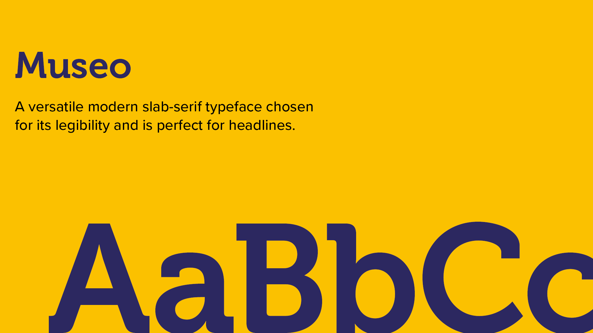
To mark Southend-on-Sea’s transition to City status the council was rebranded, requiring a new logo and brand identity.

The new identity needs to let Southend’s unique selling proposition and personality shine through as well foster sense of community with our residents, businesses, community organisations and visitors.

The new logo and brand identity must speak to Southend-on-Sea and be inextricably associated with the City only, and not interchangeable with any other council’s brand.
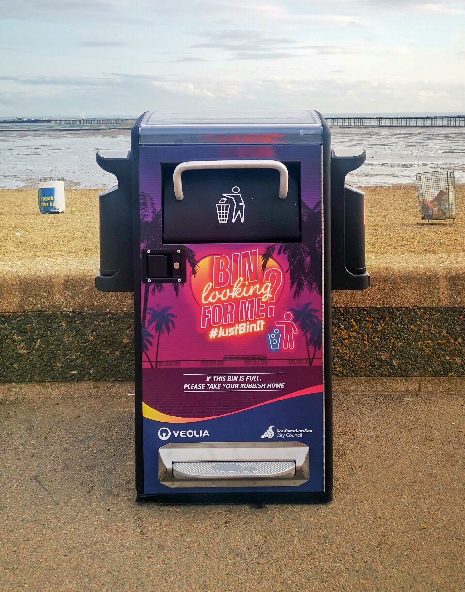
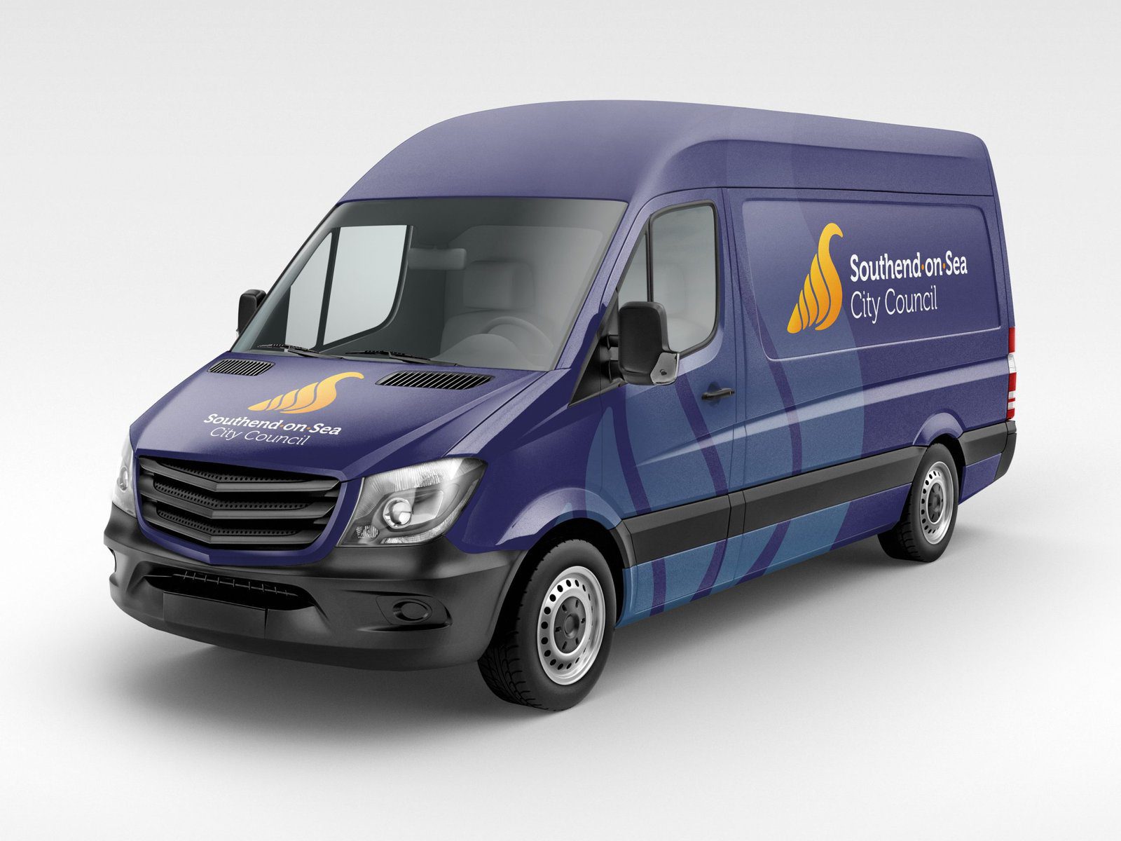
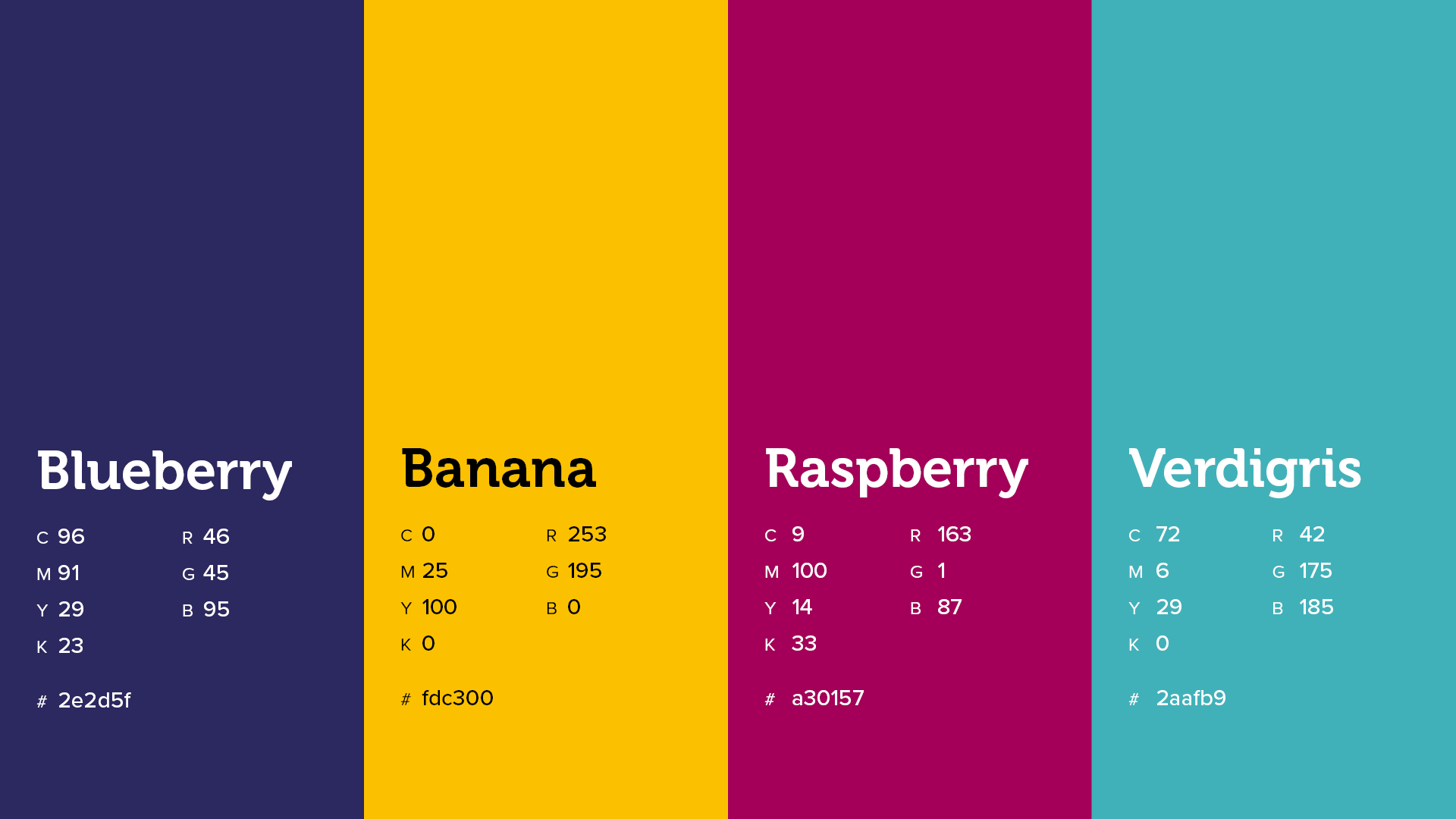
Accessibility and flexibility must at the heart of the new identity and brand style, as it needs to be used across print and digital platforms and across a plethora of diverse projects - from social media, reports and stationery to billboards, vehicles and bins

The Strategy

Drawing inspiration from Southend's rich and vibrant history, a number of concepts were created, based on local iconography, such as the Pier, famous buildings, the coat-of-arms, the Saxon King as well as abstract designs.

A final brandmark concept was chosen after presenting several preferred options to the Council Cabinet and public engagement across a diverse cross-section of the community.

Throughout the process of developing the brandmark, how it was going to be implemented as part of a wider brand scheme was at the forefront, with accessibility, flexibility and inclusivity at its heart.

To make the brandmark flexible across a wide range of mediums, horizontal and vertical orientations were created. Rather than creating a "primary" colourway, it can be used in any of the primary colours in the brand guidelines which chosen specifically to meet WCAG accessibility guidelines.

Museo, is a widely recognised accessible typeface with open forms and highly original details is used for the workmark. This is paired with Proxima Nova in the wider brand scheme that was also chosen for accessibility as well as containing the many glyphs required for multilingual documents.

Shapes derived from the Shell icon can be used as graphic devices allowing the designer to create an endless variety design schemes for a wide range of projects that retain a sense of consistency.

Brand guidelines

The visual identity overhaul was complemented by an extensive suite of branded business tools, encompassing everything from stationery and document templates to uniforms and signage. Each element was meticulously crafted to ensure a consistent brand experience at every touchpoint.

Finally, these branding efforts were consolidated into a comprehensive brand book detailing how the elements can be implemented with secondary colours, suggested grids, layouts and treatments. These guidelines were vital in maintaining clarity and consistency in the Council's new identity, ensuring that the brand’s diversity was communicated effectively across all platforms.

Brand in action

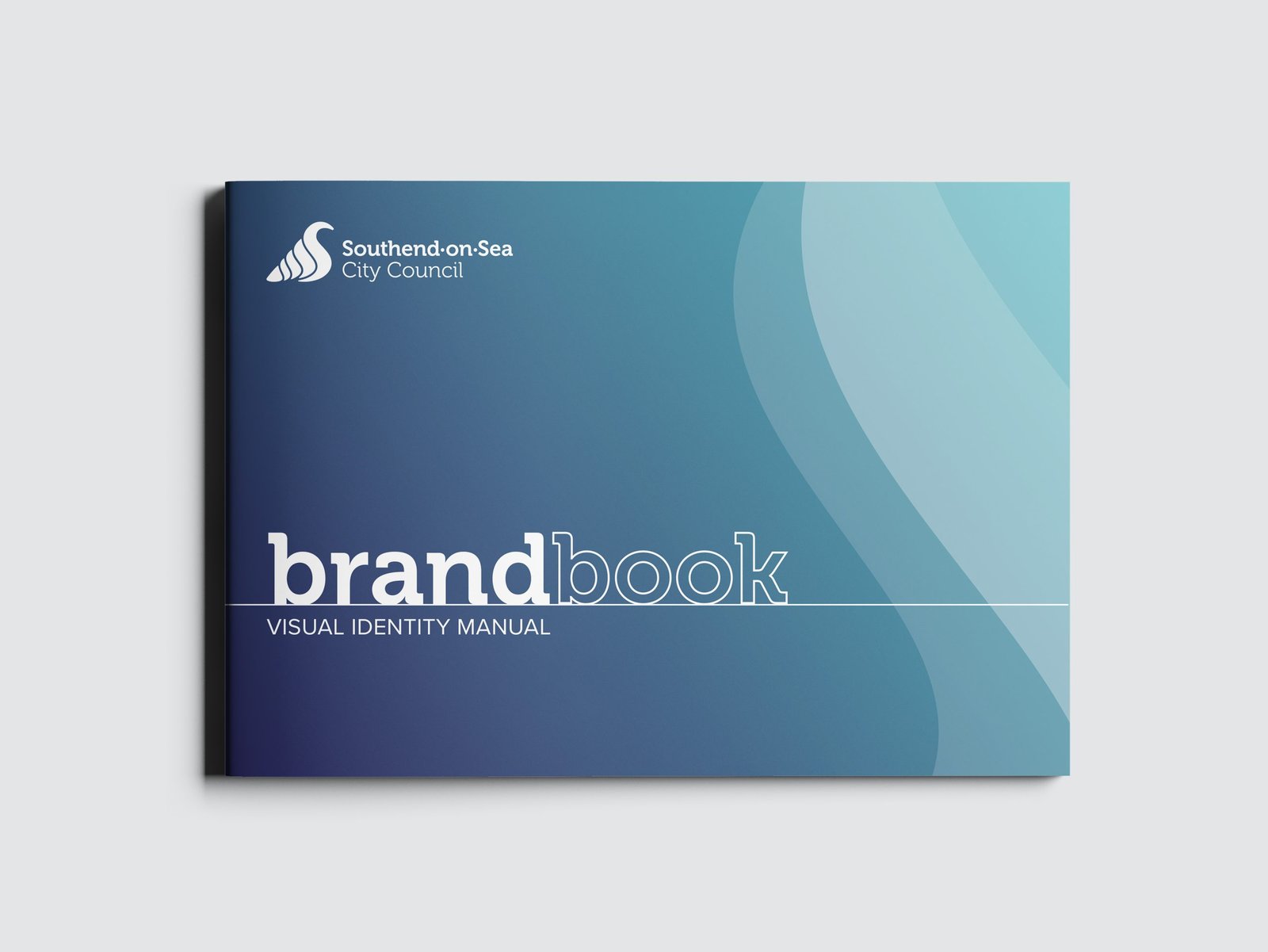
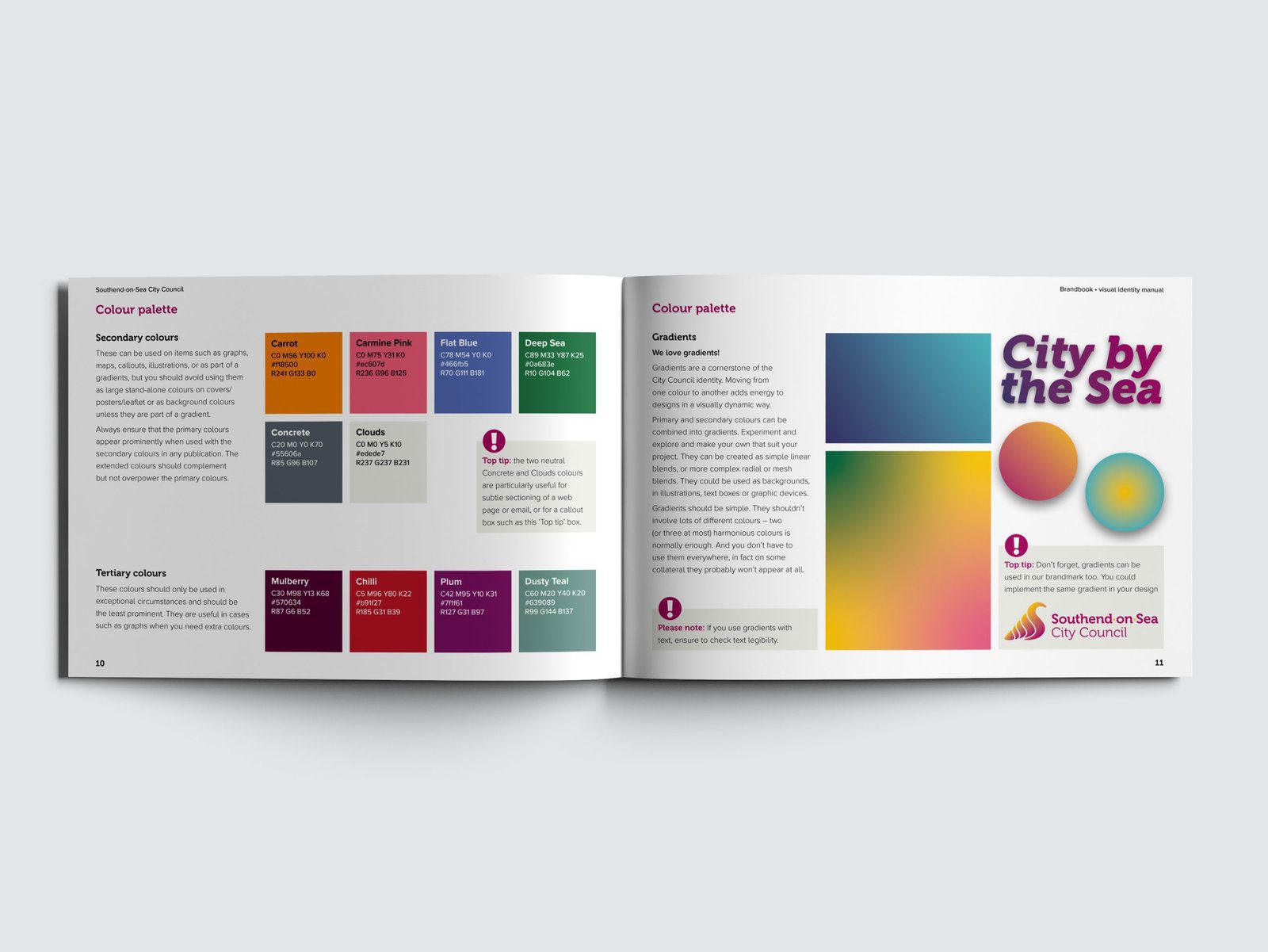
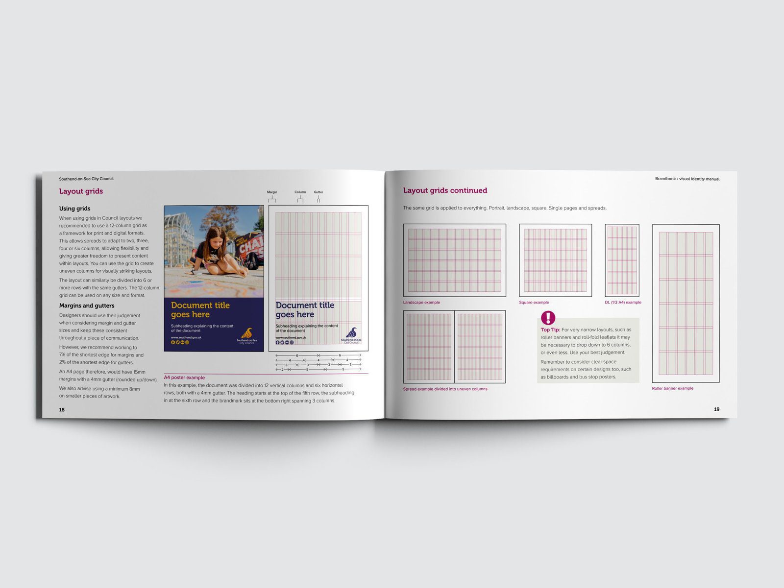
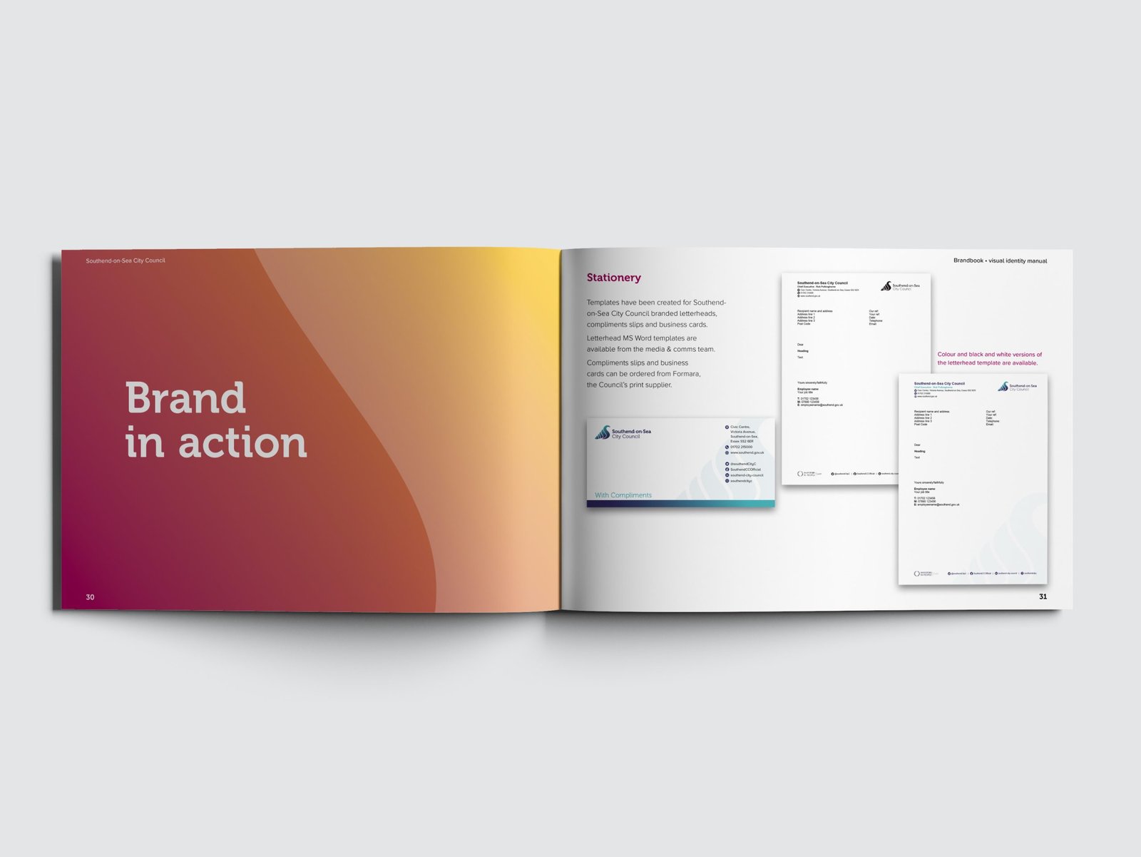
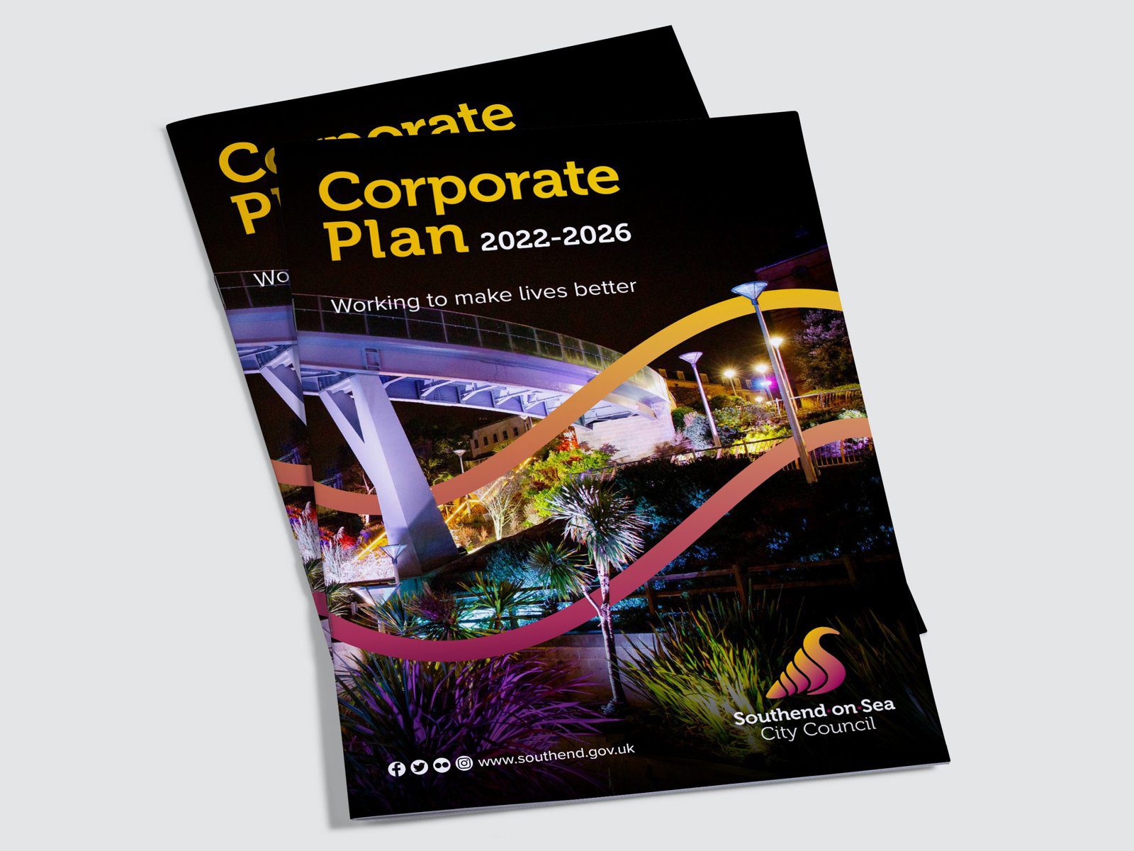
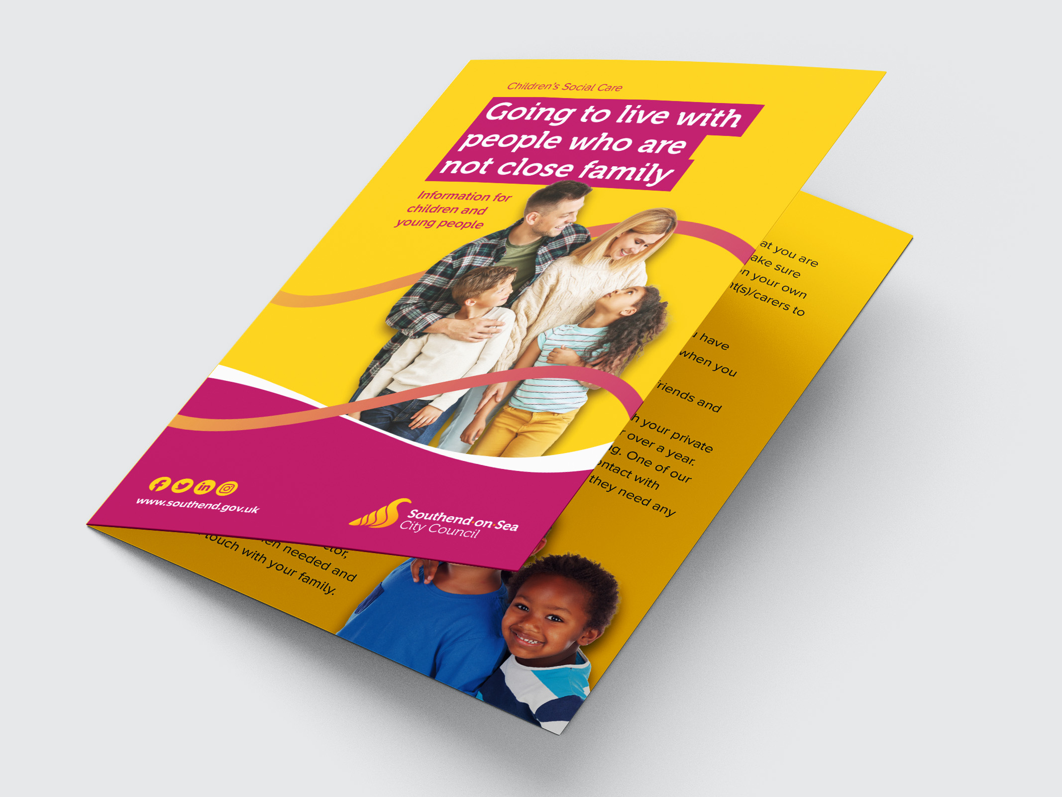
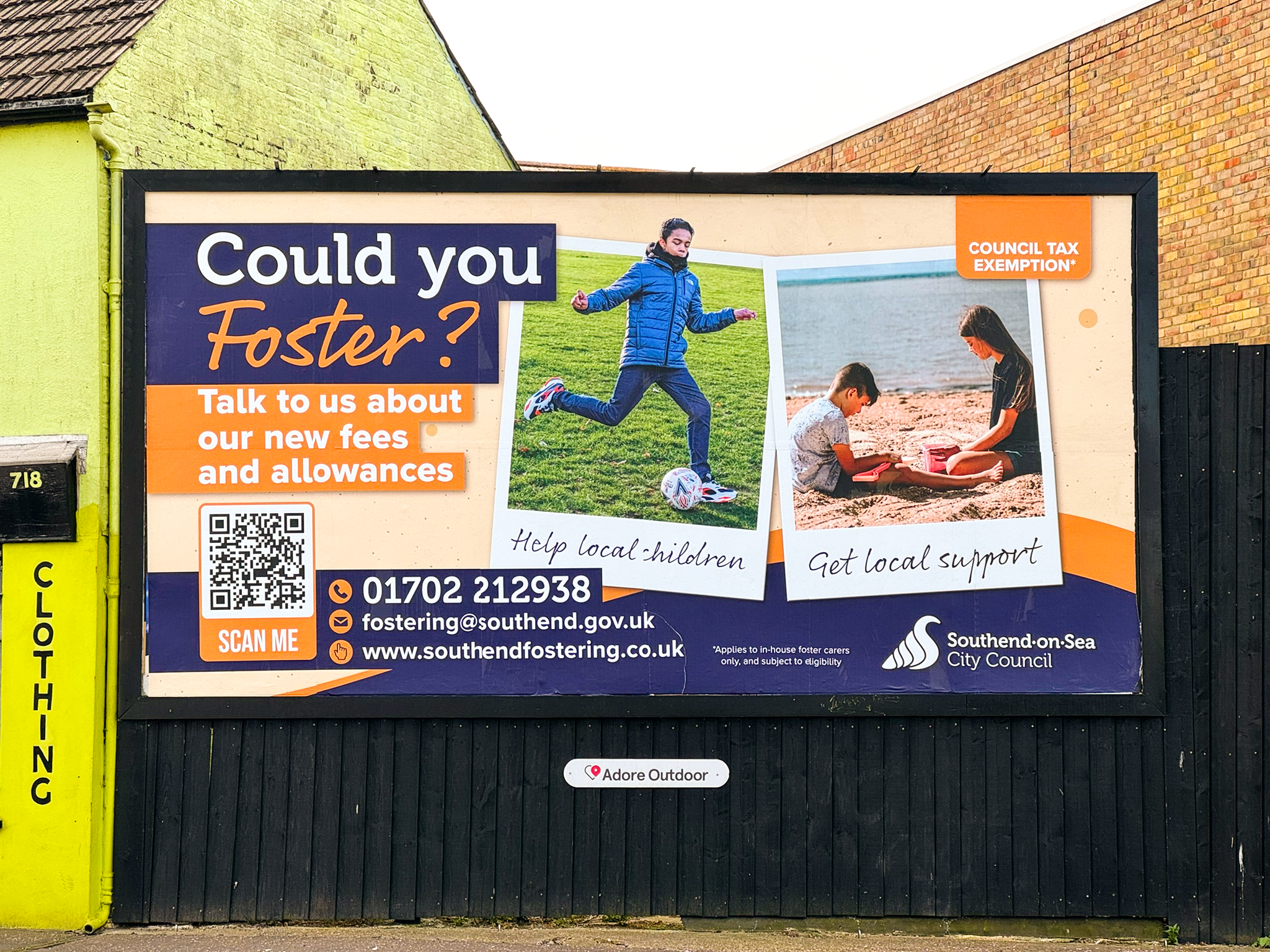
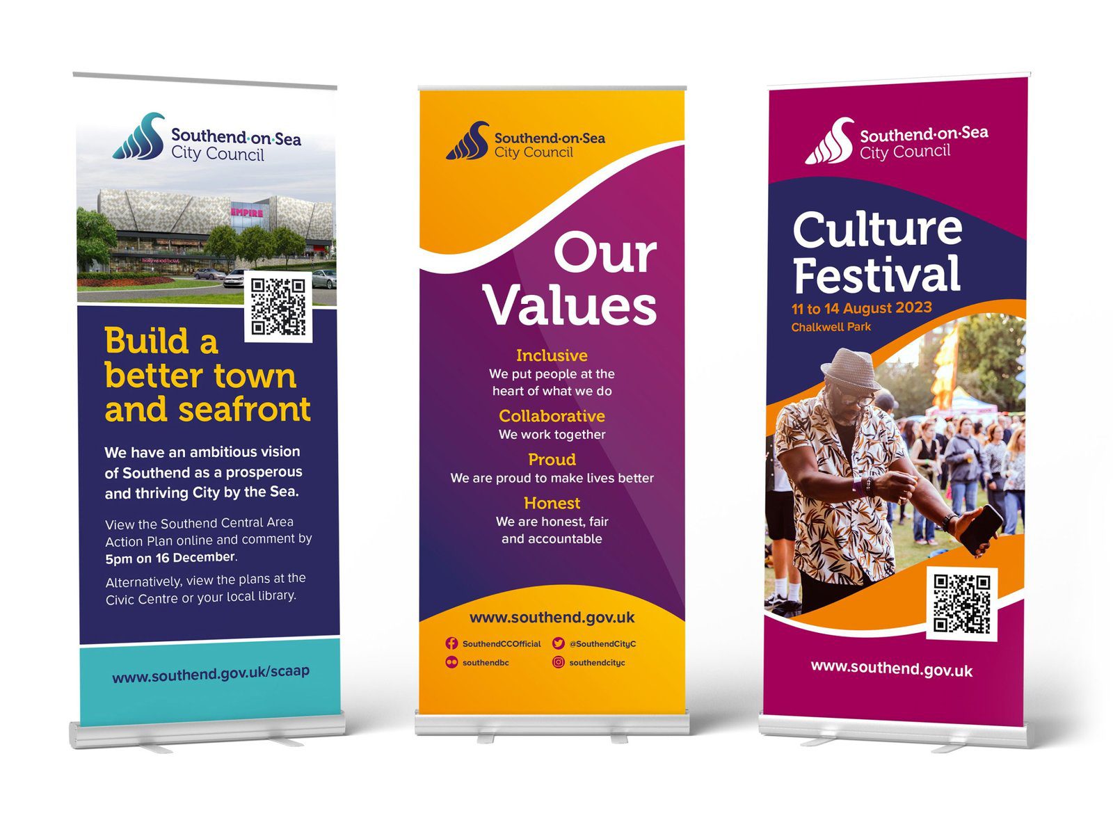
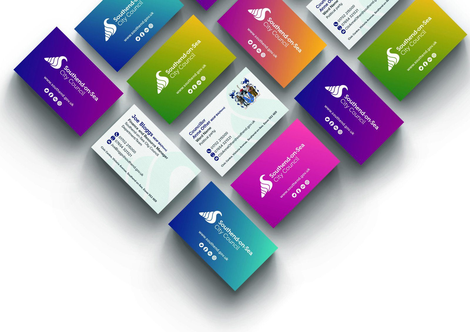
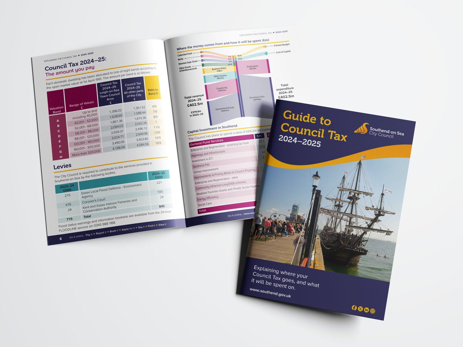
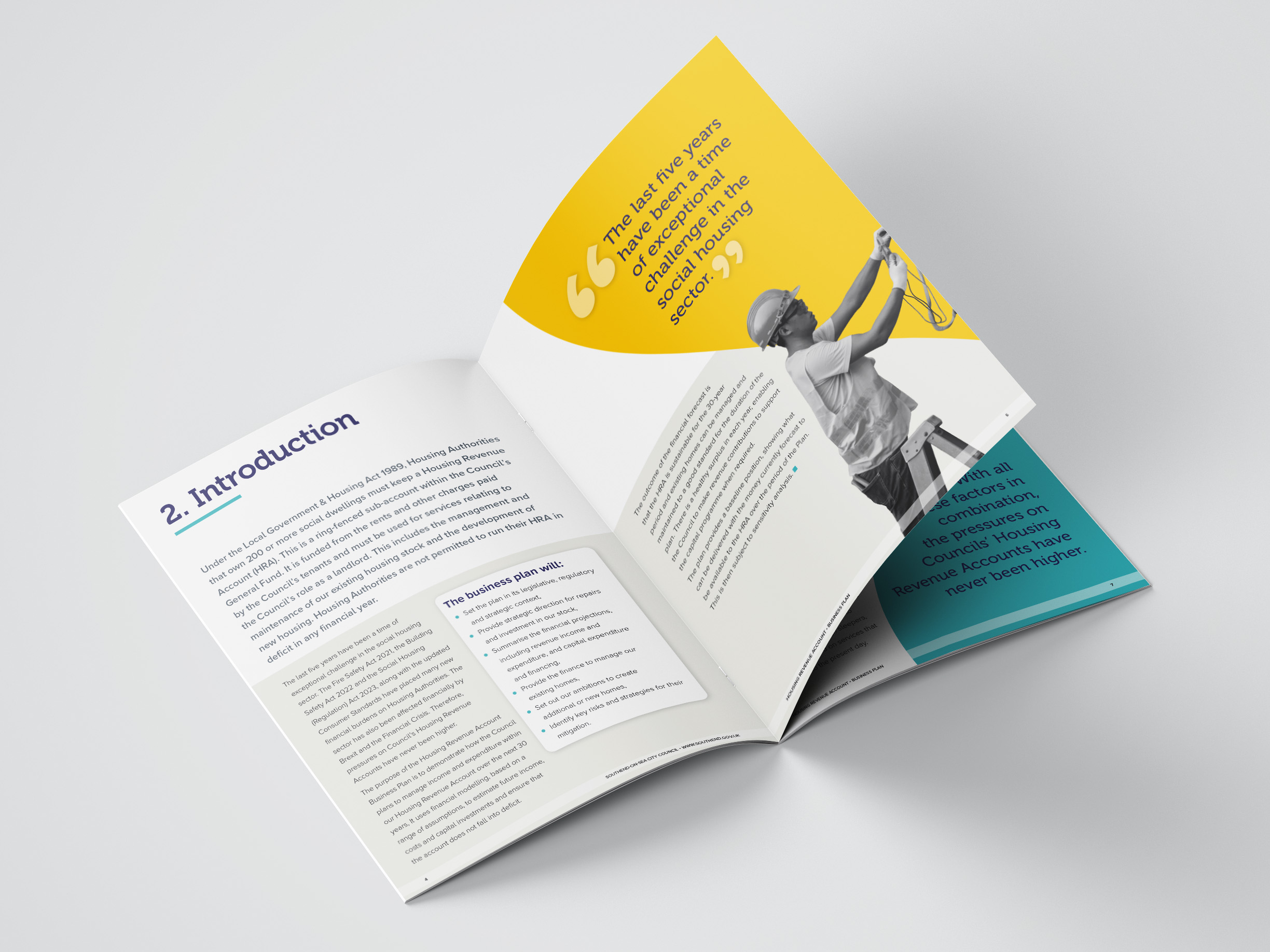
A selection of examples generated for the brand book and real life designs of documents and campaign materials created for the council with this brand.

Like what you see?

Call our team on 01702 613141 or fill in our contact form to see how we can help you.
Formara logo – Printers in Southend
Corporate Sustainability Award 2024 badge.
Contact
16 The Candlemakers
Temple Farm Business Park
Southend-on-Sea
SS2 5RX
Copyright © 2025 Formara Ltd. All rights reserved. Registered in England and Wales. Company No. 01114482, VAT no GB 251 0639 86 | Privacy Policy | Cookie Policy